off comments

As an avid rider and equestrian photographer, I know what a good jump looks like. Capturing the “perfect jump shot” can be more difficult than one would expect. It’s not just timing: its framing, using the background advantageously, the direction of light and the position of the horse and rider.

Photographing Your Performance Horse

This hunter horse and rider are well lit. The sun is falling on them and the jump is an attractive oxer. The frame is at a ¾ angle which is most flattering for horses and people, especially when the horse is jumping in good form. His knees are up, his ears are forward and his eyes are open. [Yes, sometimes they close their eyes.] Ideally, the rider should be more centered on her horse, not tipping to the right and her leg underneath her more, instead of behind as it is. I am a perfectionist and want both horse and rider looking their best.

Photographing Your Performance Horse

The jumper horse and rider are riding into the light. It beautifully sculpts the horse’s face and falls onto his neck. The jump is an attractive red oxer. I would prefer if the speaker was not in the background but being limited by the direction of the light, the type of jump and my ability to get a clear sight to the jump, this was my best option for this class. The horse is at the center of his arc and his knees are folded beautifully. He is fully attentive to the job at hand. The rider is nicely balanced on her horse making the picture almost perfect. For me, perfect would be eliminating the speaker.

There are many variables when considering which jump to choose when photographing a horse and rider combination. The jump, the direction of light and the background must all be taken into account. Much thought and skill goes into making “The Perfect Shot”.



1 comments

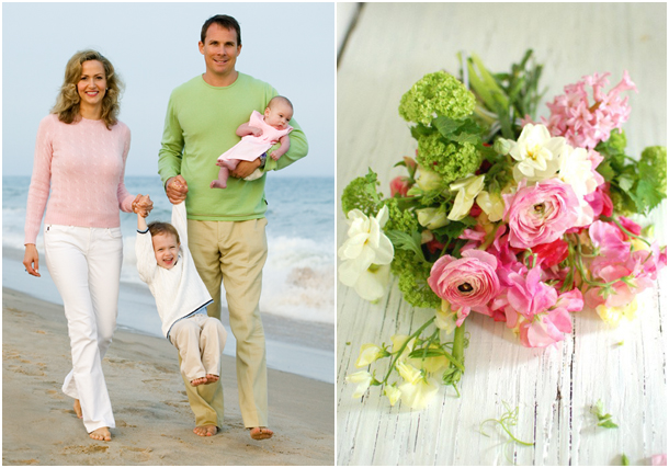
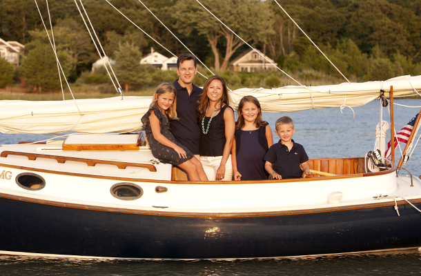
When choosing what to where for a family portrait session, I suggest to my clients to think about making a “Bouquet of Flowers.” Since color harmony represents a pleasing balance of two or more colors, not everyone has to wear the exact same colored clothing. Once you choose your basic color, either use a monochromatic relationship varying the hues of that color, or a complimentary relationship of colors that balance each other out as in a flower arrangement. Below are three samples of color choices for family portraits.

Choosing clothing for a Family Portrait Session, like a bouquet of flowers.

Complimentary: The pink, green and white colors all complement each other. Even though different colors are used, the tonality is the same and the colors blend well.

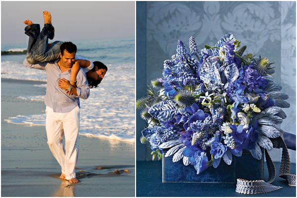
Choosing clothing for a Family Portrait Session, like a bouquet of flowers.

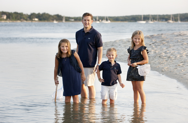
Monochromatic: A lot of portraits I make are at the beach. Blues of any shade usually look great in the finished portrait. In this photograph, the people are wearing blue and white. The blue water and white foam adds to the harmony of the finished photograph.

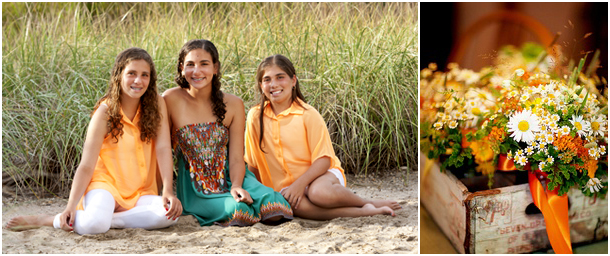
Choosing clothing for a Family Portrait Session, like a bouquet of flowers!

Complimentary: The orange and green clothing complement each other. The dune grass in the background adds to the harmonious look with the chosen colored clothing.

Don’t forget that simple and plain work best so the focus is on the person’s face. Avoid stripes, patterns and bold logos. Lighter tones are better than darker for outdoor location portraits. Most of all, remember to relax and enjoy your time together as a family. The photographer will take care of the rest!


off comments

Working as a location portrait photographer for many years, the world is my studio. My subject may be a child, a family, a bride and groom or a favorite pet. Be it a beach, garden, house or barn, I must use my environment to create an exquisite portrait. Sunlight can enhance or detract from the photograph I want to create. It helps to understand where the light is coming from [direction] and the quality of that light [soft or harsh] when positioning my subject. There are three types of lighting sources I use most.

1. BACKLIGHT: The first photograph is a demonstration of back light. There is sunlight in the hair, the faces are evenly lit. My lighting assistant has used a bounce card to add reflected light to the faces.

Sunlight portrait photography, understanding direction and quality of light

2. SIDELIGHT: The second photograph demonstrates side lighting. Half of the face is lit, the other half is shadowed. In the image below, my assistant used a reflector to add light to the shadow side of the faces. Having done this, the difference between the light side and shadow side is minimal and within the printing range of paper.

Sunlight portrait photography, understanding direction and quality of light

3. DIRECT LIGHT: Direct light at dawn and dusk has a soft orange glow. There is no need to add light or take it away. It is perfect as is. This is my favorite type of light and works when clients are earlier risers or patient at the end of the day and we are blessed with sunlight!

Sunlight portrait photography, understanding direction and quality of light

Light defines the face. Shadow gives it dimension. Expression gives it heart and soul!


Show More Posts