
Clothing Choices For Family Portrait Photography
When choosing what to wear for a family portrait session, I suggest to my clients to think about making a “Bouquet of Flowers.” Since color harmony represents a pleasing balance of two or more colors, not everyone has to wear the exact same colored clothing. Once you choose your basic color, either use a monochromatic relationship varying the hues of that color, or a complimentary relationship of colors that balance each other out as in a flower arrangement. Below are three samples of color choices for family portraits.
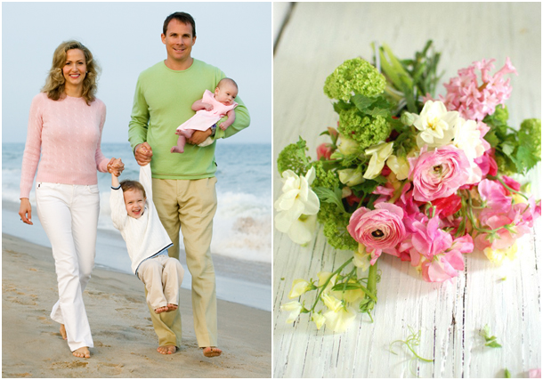
Complimentary: The pink, green and white colors all complement each other. Even though different colors are used, the tonality is the same and the colors blend well.
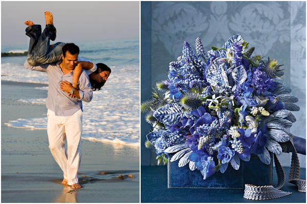
Monochromatic: A lot of portraits I make are at the beach. Blues of any shade usually look great in the finished portrait. In this photograph, the people are wearing blue and white. The blue water and white foam adds to the harmony of the finished photograph.
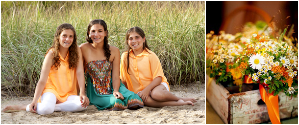
Complimentary: The orange and green clothing complement each other. The dune grass in the background adds to the harmonious look with the chosen colored clothing.
Don’t forget that simple and plain work best so the focus is on the person’s face. Avoid stripes, patterns and bold logos. Lighter tones are better than darker for outdoor location portraits. Most of all, remember to relax and enjoy your time together as a family.